

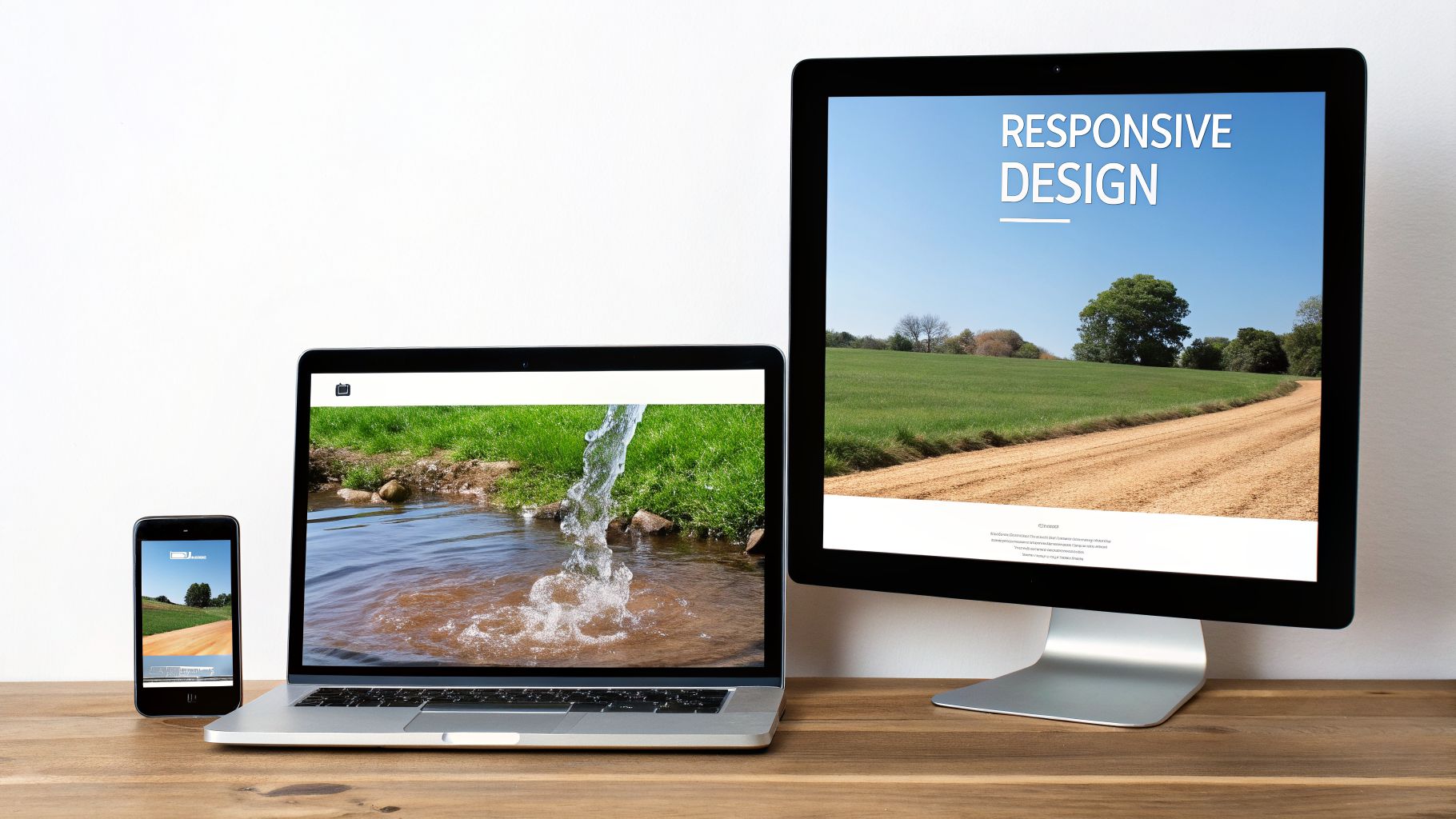
Think of your website as being made of water. It doesn't matter if you pour it into a wide, shallow bowl or a tall, thin glass—it always adapts perfectly to fit the container. That, in a nutshell, is the core idea behind responsive web design.
It's a way of building websites so they automatically reformat themselves to give every visitor the best possible experience, whether they're on a massive desktop monitor, a laptop, a tablet, or a smartphone.
What Does This Actually Mean for Your Business?
Responsive design isn't just a bit of technical wizardry; it's a fundamental part of a modern business strategy. It’s about making sure your business shows up properly for every single person, no matter how they’ve found you online. A practical case is a retail business in Sydney seeing a surge in mobile traffic; a responsive Shopify implementation ensures these visitors can browse and buy without friction, directly boosting sales.
The numbers for Australian businesses are hard to ignore. Mobile devices now account for over 61% of all website traffic in Australia, and more than 65% of first-time interactions with a business happen on a phone. The reality is, if your site doesn't work on mobile, you're actively turning away customers. A staggering 57% of Aussie users admit they’ll leave a site immediately if it’s clunky or hard to use on their phone. You can dig deeper into these figures by checking out more Australian website design statistics.
Any modern business that wants to succeed needs a website that delivers a consistent, high-quality experience everywhere. A broken or confusing mobile site sends a clear message to your customers: you don't value their time or their business.
This means that when a customer is looking at your Shopify implementation on their train ride home, or a business partner in Adelaide is checking your B2B portal on their tablet, the experience feels seamless. It’s about being there for your audience, on their terms.
Adopting a responsive design brings several immediate and powerful advantages to your business.
Immediate Benefits of a Responsive Website
| Benefit | Impact on Your Business | Key Statistic |
|---|---|---|
| Increased Engagement | A smooth mobile experience keeps visitors on your site longer, making a sale or enquiry more likely. | Users are 67% more likely to convert on a mobile-friendly site. |
| Better SEO Rankings | Google's algorithm rewards mobile-friendly sites, improving your visibility in search results. | Over 60% of searches now happen on mobile devices. |
| Simplified Management | One responsive site is far cheaper and easier to manage than separate desktop and mobile versions. | Reduces long-term maintenance costs and development time. |
These benefits demonstrate that a responsive site isn't just a "nice-to-have"; it's a core asset that directly contributes to your bottom line.
Whether you're setting up a WooCommerce store, looking into custom software development in Sydney or Adelaide, or planning an Odoo implementation, a responsive approach is essential from day one.
As your dedicated ODOO partner in Sydney and Adelaide, the team at Wistec is here to build you a website that doesn't just look great but works flawlessly for every single customer. Contact us today to start your responsive transformation.
The Three Pillars of Responsive Design
So, how does responsive web design actually work its magic? It’s not a mystery, but a clever combination of three core technical principles working in perfect harmony. Getting your head around these concepts will give you the confidence to talk shop on your next web project, whether it's custom software development in Sydney or a new Shopify implementation.
Think of your website as an intelligent, modular building. These three pillars are the architectural principles that let it reconfigure itself for any visitor, on any device.
Pillar 1: Fluid Grids
A fluid grid is the foundational blueprint of any responsive site. Instead of relying on rigid, fixed measurements like pixels, this approach uses relative units like percentages. It’s a game-changer.
Imagine your website's content is arranged in three columns on a desktop. A fluid grid tells each column to take up 33.33% of the screen's width. As the screen gets smaller (say, on a tablet), those columns automatically shrink but keep their proportions, ensuring the layout always fits perfectly.
A fluid grid is like having adjustable walls in a room. The walls can slide and resize to ensure the space is always used efficiently, no matter the overall size of the room. This is what makes a design feel fluid rather than broken.
This is absolutely crucial. It guarantees that whether a customer is browsing your WooCommerce store on a huge monitor or a small tablet, the layout feels deliberate and well-organised, not forced into a space it wasn't designed for.
Pillar 2: Flexible Images
Flexible images are the second pillar, making sure all your visual content adapts beautifully within the fluid grid. If your grid columns shrink but your images stay a fixed size, they’ll spill over, break the layout, and create a truly awful user experience. We've all seen it happen.
To prevent this disaster, responsive design sets images and other media to scale proportionally. This is often done with a simple but powerful rule: an image should never be wider than the container it sits in. As the column shrinks, so does the image, always fitting perfectly. This is a non-negotiable part of a quality user interface, and you can dive deeper into the importance of UI in modern websites in our detailed guide.
Pillar 3: Media Queries
Media queries are the real intelligence behind the whole operation. Think of them as simple filters that check the device being used—its screen width, height, and even orientation—and then apply specific style rules based on what they find.
- For a wide desktop screen, a media query might apply a spacious, three-column layout.
- For a mid-sized tablet, it might smartly switch to a two-column view.
- For a narrow smartphone screen, it will instruct the columns to stack vertically, creating a single, easy-to-scroll column.
It's this on-the-fly decision-making that allows even a complex site, like one integrated with an ERP, to remain fully functional and intuitive across every device. A practical case for this is a logistics company needing software development Sydney Adelaide to build a client portal that works perfectly on a desktop in the office and a smartphone for a driver on the road. As a leading ODOO partner in Adelaide and Sydney, we see firsthand how vital it is that your entire digital ecosystem works flawlessly everywhere.
Ready to see how these pillars can build a stronger, more adaptable digital presence for your business? Contact Wistec for a no-obligation consultation and let's create a responsive website that delivers real results.
Why a Non-Responsive Site is Actively Costing You Money
Let's cut through the technical jargon and talk about what really matters: your bottom line. In 2026, having a website that doesn't work on mobile isn't just a minor oversight—it's an active drain on your revenue. Every single person who lands on a clunky, hard-to-use mobile site is a lost opportunity and a direct hit to your profitability.
Think about it. A manufacturing firm in Sydney could lose a massive B2B lead simply because their online parts portal is unusable on a prospect's tablet during a crucial site visit. Or picture an Adelaide-based retailer whose Shopify implementation loses out on evening shoppers because trying to check out is a nightmare of pinching and zooming on a smartphone. These aren't just hypotheticals; this is happening every day to businesses that haven't caught up.
The High Price of a Poor User Experience
A non-responsive site tells your audience one thing loud and clear: you don't value their time. That friction doesn't just annoy them; it has immediate financial consequences that ripple through your entire business, from lost sales to a tarnished brand. Honestly, the cost of doing nothing is far greater than the investment in getting it right.
The data for Australian businesses paints a very clear picture. For more than half of local companies, adopting responsive web design has led to real, tangible sales growth. We're not talking small change. Reports show that over 50% of firms see significant uplifts after making the switch. Responsive sites convert 11% higher than their old-school counterparts and can achieve up to 40% better conversion rates on mobile devices. You can dig into more of these numbers and see how responsive design boosts sales in Australia.
The numbers really do speak for themselves. For every $1 invested in user experience (UX)—and responsive design is a huge part of that—the average return is a staggering $100. That’s a 9,900% ROI. No forward-thinking business, whether in manufacturing, healthcare, or professional services, can afford to ignore that.
This is exactly why a non-responsive site is a direct roadblock to growth. It doesn't matter if you're running a WooCommerce store or managing a complex B2B service portal; a poor mobile experience is actively costing you money and, worse, handing customers directly to your competitors.
From Lost Leads to Damaged Trust
The damage goes deeper than just immediate sales. A non-responsive website steadily erodes the trust people have in your brand and torpedoes your search engine rankings, creating long-term headaches. Google prioritises mobile-friendly sites, which means your outdated site is likely being buried in search results, making you practically invisible to new customers.
This isn't industry-specific, either. A logistics company that needs sophisticated software development in Sydney for its client portal has to ensure it works flawlessly on the go. In the same way, a healthcare provider searching for an ODOO partner in Adelaide to manage patient records needs a system that's secure and easily accessible on any device, from anywhere.
At the end of the day, a non-responsive site is a liability. It creates a vicious cycle of poor user experience, high bounce rates, plummeting search rankings, and, ultimately, lost revenue. The real question isn't whether you can afford to go responsive, but whether you can truly afford not to.
Ready to stop leaving money on the table and start building a digital presence that actually drives growth? Contact Wistec today for a no-obligation consultation. We’ll show you how a responsive website, a powerful Odoo implementation, or a new eCommerce platform can transform your business.
Choosing Your Path to a Responsive Website
Okay, so you get it. You understand what responsive design is, and more importantly, you realise a non-responsive site is actively costing you money. The next logical question is: what now?
So, what are the practical ways to get a fully responsive website that actually delivers results? The best approach really hinges on your specific business goals, what technology you’re using right now, and of course, your budget.
This simple decision tree gets right to the point.
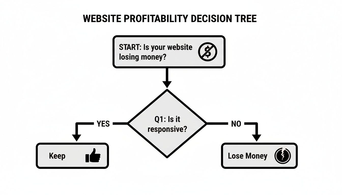
The image drives home a simple truth: if your site isn’t responsive, you’re on a direct path to losing money. The good news is you have clear options to get back on track and turn your website into a powerful asset.
Route 1: Use a Responsive-First Platform
For many businesses, especially those in eCommerce, the quickest way to get a responsive site is to build on a platform designed with mobile in mind from day one.
- Shopify Implementation: This is a brilliant choice for retailers who need to get to market fast. Modern Shopify themes are inherently responsive, meaning your customers get a seamless shopping experience on any device. This is absolutely critical for turning mobile browsers into buyers.
- WooCommerce: Built on the ever-flexible WordPress platform, WooCommerce delivers powerful eCommerce features with a massive library of responsive themes. It strikes a great balance between control and ease of use.
Route 2: Custom Software Development
What if your needs are more complex than a standard template can handle? That's where custom software development in Sydney or Adelaide offers unmatched flexibility. This is the ideal path for businesses with unique requirements, like a bespoke client portal or a B2B ordering system that has to work just as well on a tablet in the field as it does on a desktop in the office.
This route allows you to build a website or application precisely to your specifications, ensuring it connects perfectly with your other critical business systems. A practical case is a company requiring an Odoo implementation and needing a custom front-end that seamlessly communicates with its ERP. To see what's possible, you can learn more about our custom approach to responsive web app development.
A recent report highlights this urgency, showing a whopping 42% of Australian SMEs are planning website redesigns through 2026 specifically to address mobile performance. This is a direct response to 61% of traffic now coming from mobile and the fact that 57% of users will abandon a site with a poor mobile experience.
Route 3: Retrofit Your Existing Site
If you have a large, established website that isn’t responsive, a complete rebuild isn't always the only answer. It's often possible to "retrofit" your current site by applying responsive principles like fluid grids and media queries to the existing code.
While this can be a cost-effective solution, it needs careful planning to ensure the user experience remains consistent. To help guide that journey, have a look at these 9 responsive design best practices that will help ensure your site adapts seamlessly.
As a dedicated ODOO partner in Sydney Adelaide, we can help you decide which path makes the most sense for your business. Whether it’s a fast Shopify implementation or a ground-up enterprise system, Wistec has the expertise to guide you. Don't hesitate to contact us for a free consultation to discuss your options.
Testing and Optimising for Peak Performance
Getting your responsive website live is a huge milestone, but it's really just the starting line. The real work—and the real results—come from what you do next. It’s all about continuous testing and optimisation to make sure your site performs brilliantly for actual users, not just in a developer's perfect test environment.
Think of it from your customers' perspective. You might have a client in Adelaide trying to view your services on a patchy 4G connection, while a partner in Sydney browses your portal on a giant desktop monitor. Both need a flawless experience, and the only way to deliver that is through rigorous, ongoing testing. This is how you turn your investment in responsive design into a genuine business asset.

Key Testing Methods and Metrics
A smart testing strategy is multi-layered. Of course, you can start with the basics, like using your browser’s developer tools to quickly spot obvious layout breaks on different screen sizes. But to truly get under the hood of your site's performance, you need to go deeper.
- Real-Device Testing: There's no substitute for the real thing. Testing on actual smartphones and tablets uncovers issues that simulators and emulators just can't catch, like clumsy touch targets or performance lags on specific devices.
- Performance Audits: Tools like Google PageSpeed Insights are your best friend here. They pinpoint technical bottlenecks that slow your site down, especially on mobile, which is a notorious cause of high bounce rates.
- User Feedback: Why guess what your users are thinking? Just ask them. Simple surveys and feedback forms can reveal frustrations and pain points you’d never discover on your own.
To maintain visual consistency and catch layout bugs before they go live, it’s worth integrating visual regression testing tools into your process. These tools automatically flag unintended visual changes, ensuring your design stays pixel-perfect across updates. A great design is also an inclusive one, and you can learn more about this in our article on accessibility in modern web design.
Digging into device-specific metrics like mobile bounce rates or tablet conversion rates gives you actionable insights. For example, if your Shopify implementation has a high bounce rate on mobile, it might be a clear signal that your checkout flow is too cumbersome for a small screen. This is a practical case we often solve for clients.
This data-first mindset is what separates a good website from a great one. Whether it’s for custom software development in Sydney Adelaide or an Odoo implementation, we dive deep into these metrics to constantly refine the user journey and boost conversions. The end goal is always to create a powerful digital platform—be it a WooCommerce store or a sophisticated B2B portal—that works tirelessly for your business.
As your dedicated ODOO partner in Sydney Adelaide, we don’t believe in a ‘set and forget’ approach. We build, test, analyse, and optimise to ensure your technology investment delivers a real, measurable return.
Ready to build a website that performs as well as it looks? Contact Wistec for a no-obligation consultation today.
Ready to Make Your Move?
You’ve seen what responsive web design is, why it’s absolutely essential, and the different ways you can get there. The next step is the most important one: turning that knowledge into action. It’s time for an honest look at your current website. Is it pulling its weight and driving growth, or is it holding you back?
That’s where having the right technology partner changes the game. At Wistec, we don't just build websites. We engineer high-performance digital platforms that become the engine for your business growth.
Let's Build Your Competitive Edge
Whether you're after a high-converting Shopify implementation or a powerful, flexible WooCommerce store, we build eCommerce experiences that turn mobile visitors into loyal customers. Our skills go far beyond standard websites, covering complex projects like custom software development in Sydney and seamless Odoo implementation to bring your entire operation together.
Think of your website as your hardest-working salesperson—it’s on the clock 24/7. Is yours closing deals on a smartphone in a café, a tablet on the factory floor, and a desktop in the office? If the answer is no, every moment you wait is another customer walking away.
As a dedicated ODOO partner in Sydney Adelaide, we specialise in creating robust, future-proof systems designed to deliver real, measurable results. We get deep into the technical weeds of what makes a responsive site truly great, freeing you up to do what you do best: run your business.
Don’t let an old, clunky website cost you another sale. Your competitors are already winning over the mobile market, and every day you delay is another day you fall further behind. It’s time to stop losing customers and start capturing them.
Take the first step. Get in touch with Wistec today for a no-obligation chat, and let’s talk about building a responsive, SEO-ready website that actually fuels your growth.
Still Have a Few Questions?
It's completely normal to have questions before diving into a project. Here are some of the most common things we discuss with business owners, hopefully clearing up those last few details for you.
What's the Real Cost of a Responsive Redesign?
That's the million-dollar question, isn't it? The truth is, the investment really hinges on what you want to achieve.
For an e-commerce store, a fresh look using a pre-existing Shopify implementation template can be a smart, budget-friendly move. On the other hand, if you're after a completely unique system that integrates deeply with your business operations, a custom software development Sydney project involving an Odoo implementation will naturally require a larger investment. The payoff, however, is a solution built precisely for your workflow, delivering incredible returns.
Here at Wistec, we don't do guesswork. We provide transparent, detailed quotes based on your specific needs, so you always know you're getting the best possible value and performance. Request your free quote today.
Isn’t 'Responsive' Just Another Word for 'Mobile-Friendly'?
Not quite, and the difference is crucial. Think of a 'mobile-friendly' site as the bare minimum—it works on a phone, but it's often just a shrunken, hard-to-navigate version of your desktop site. It’s functional, but rarely enjoyable.
'Responsive' is the modern gold standard. It’s a single, intelligent website that gracefully reconfigures itself to provide the best possible experience on any screen, from a giant monitor to the smallest smartphone. Google heavily favours responsive design because it’s cleaner and avoids the SEO pitfalls of duplicate content, giving your site a serious competitive edge.
How Does This Work with Platforms like Shopify or Odoo?
This is where responsive design truly shines for a modern business.
- For e-commerce platforms like Shopify or WooCommerce, a responsive site means your customers get a flawless, intuitive shopping journey whether they’re on their laptop, tablet, or phone. This directly translates to fewer abandoned carts and more sales.
- When you integrate this with an ERP like Odoo, responsiveness empowers your entire team. Imagine managing inventory on a tablet in the warehouse or checking customer details on your phone while out on a sales call. It makes your whole operation more agile.
As your ODOO partner in Sydney Adelaide, we specialise in making your technology work for you, no matter where you are. A responsive design bridges the gap between your customer-facing website and your powerful back-end systems, creating one cohesive, remarkably efficient business tool.
Ready to turn your digital presence into a genuine asset that drives growth? Wistec builds responsive websites and integrated business systems that deliver tangible results. Contact us today for a no-obligation consultation and let's talk about what's possible.