

Web App development
Responsive Web App development is all about building applications that just work, no matter the screen. Think about it – your app needs to look and feel great on a giant desktop monitor, a tablet, and a tiny smartphone. It’s not just a neat technical trick anymore; it's a core part of how you win and keep customers in a world that lives on mobile.
Having a non-responsive app is like setting up a beautiful shop but randomly locking the door for half the people who try to come in. You're just turning business away.
Why Responsive Design Is a Core Business Strategy
We've all been there. You're on your phone, trying to use a web app, and it's a clunky, hard-to-navigate mess. It doesn't just frustrate you; it actively hurts the business behind it. We're talking lost sales, a damaged brand reputation, and a clear message to potential customers that their experience isn't valued.
This isn't a new trend, either. The need for responsive web app development really kicked into gear as mobile phones took over Australia, completely changing how we all behave online. While Audi.com first dabbled with responsive design way back in 2001, the game truly changed in 2011. That's when Google started prioritising mobile-friendly sites in its search results.
Fast forward to today, with Australians spending up to 4.2 hours daily on their smartphones and mobile traffic making up over 54% of all web traffic, a responsive app is non-negotiable. It's a ticket to the game. You can find more great insights about current responsive web app trends on ramotion.com.
The Tangible Costs of a Poor User Experience
Ignoring responsiveness is a recipe for disaster. A user forced to pinch, zoom, and hunt for a button is a user who will abandon ship and head straight for a competitor. This isn't just one missed sale; it's a domino effect of failures.
These failures show up in a few key ways:
- Plummeting SEO Rankings: Search engines like Google will actively penalise your site if it’s not mobile-friendly. You’ll simply become harder to find.
- High Bounce Rates: When someone lands on a page that’s a pain to use, they leave immediately. This tells search engines your content isn't very good.
- Damaged Brand Credibility: A clunky app sends a clear message: you don't care about the details. It just looks unprofessional.
Think of your responsive web app as your digital front door. If that door is jammed or too hard to open on whatever device your customer is using, they won’t force it. They’ll just walk down the street to a competitor whose door is wide open.
Seizing the Competitive Edge in Australia
For businesses in our competitive local markets, getting expert software development Sydney and Adelaide is how you get ahead. A truly responsive web app is a huge differentiator that builds customer loyalty and drives sales.
It doesn’t matter if it’s a slick checkout process through a Shopify implementation or a user-friendly dashboard for a complex Odoo implementation Sydney – the experience has to be flawless on every single device.
At the end of the day, putting money into Web App development that puts responsiveness first isn't just an IT cost. It's a strategic investment in bringing in new customers and keeping the ones you have.
Are you ready to build a web app that works beautifully for every customer, on every screen?
Contact Wistec today for a consultation on building a responsive web app that drives growth.
The Building Blocks of a Truly Responsive App

So, how do you actually build an app that feels great everywhere? It all comes down to three foundational concepts working together. Forget complex code for a moment and think of them as simple, powerful principles that make all the difference.
A non-responsive app is like a rigid concrete building—it’s fixed, and it cracks under pressure when you try to squeeze it onto a different-sized block. A responsive app, on the other hand, is built with LEGOs. It can reconfigure itself perfectly for any space it needs to fill.
This isn’t magic; it’s the result of combining fluid grids, flexible images, and media queries. Getting your head around these is the first step to understanding why one web app feels intuitive and another just feels broken.
Let's break down these core principles to see how they work.
Core Responsive Design Principles
| Principle | What It Does | Key Business Benefit |
|---|---|---|
| Fluid Grids | Uses relative units (like percentages) instead of fixed pixels, allowing the layout to stretch or shrink based on screen size. | Ensures a consistent, professional look on all devices, preventing broken layouts that damage brand perception. |
| Flexible Images | Scales images and other media to fit perfectly within their container, no matter how it resizes. | Prevents slow load times and awkward scrolling, which directly improves user experience and keeps them engaged. |
| Media Queries | Applies different CSS styles based on device characteristics like screen width, height, or orientation. | Delivers a truly optimised experience by showing the right content in the right way for each device. |
Each of these principles plays a critical role. When they're all working in harmony, the user doesn't even notice them—they just know the app works beautifully.
Fluid Grids: The Flexible Blueprint
At the heart of any responsive design is the fluid grid. This is a fundamental shift away from designing with fixed pixel widths, like saying a box must be exactly 800 pixels wide. Instead, a fluid grid uses relative units like percentages. This means layout elements are sized in proportion to the screen they’re on.
Think of it like a photo frame. A fixed-width design is like having one frame that’s always A4 size. It looks great on an A4-sized wall, but it’s too big for a tiny shelf and looks lost on a massive wall. A fluid grid is like a frame that magically resizes to always take up, say, 50% of whatever surface it’s on.
This approach ensures your content—whether it's text, buttons, or product listings—arranges itself logically, preventing awkward overlaps or huge empty gaps. For businesses looking for software development in Sydney, this is the first principle that separates a professional build from a half-baked one.
Flexible Images: Content That Adapts
Next up, we have flexible images. Nothing ruins a mobile experience faster than a giant, high-resolution image that takes ages to load and forces you into a frustrating cycle of pinching and zooming. Flexible images solve this by scaling down proportionally to fit inside their container.
So, if a column in your fluid grid shrinks to 40% of the screen width on a phone, a flexible image inside it automatically shrinks to fit perfectly. This delivers two massive benefits:
- A Better User Experience: Images and videos always look right. They never break the layout or force users to scroll sideways just to see what’s there.
- Faster Load Times: Developers can serve different image sizes based on the device, meaning a mobile user doesn't waste data loading a gigantic desktop-sized photo. Speed is everything when it comes to conversions.
For a retail business with a Shopify implementation or WooCommerce site, flexible images are completely non-negotiable. Slow-loading product photos are a direct cause of abandoned carts and lost sales. The goal is to deliver sharp visuals without the performance hit.
Media Queries: The Smart Director
Finally, media queries are the 'smart director' of your web app. They’re basically simple filters in the code that check the characteristics of a device—most often its screen width—and then apply specific style rules.
Think of it like this: a media query asks the browser, "Is this screen smaller than 768 pixels wide?" If the answer is yes (meaning it's probably a phone), it can trigger a completely different set of instructions. It might tell a three-column desktop layout to stack neatly into a single, scrollable column. It could also hide less important elements or enlarge fonts to make them readable on a small screen.
This is what allows a complex system, like an Odoo implementation in Sydney, to show a dense data dashboard on a desktop but a clean, touch-friendly interface on a tablet. For expert software development Adelaide, mastering media queries is essential for building apps that aren't just functional, but genuinely pleasant to use everywhere.
Ready to see how these building blocks can create a powerful app for your business? Speak to a Wistec expert today and start your project.
Choosing the Right Technology for Your Project
Picking the right technology for your responsive web app is a bit like choosing an engine for a car. You wouldn't stick a hatchback engine in a massive road train, and you certainly wouldn't use a giant diesel for a quick city runabout. The "best" technology isn't a one-size-fits-all solution; it’s the one that perfectly matches what you’re trying to achieve with your business.
This decision is absolutely critical. Your technology stack—the mix of frontend frameworks, backend languages, and databases—is the foundation of your app. It determines how fast it runs, how easily you can add new features down the track, and what it’s going to cost you to keep it running smoothly. Getting this right from the start saves a world of headaches and costly rebuilds later on.
For business owners, getting a handle on the main players means you can have much more meaningful conversations with your development partners. It’s all about making sure the technical solution lines up with your commercial goals.
Popular Frontend Frameworks Explained
The frontend is everything your user sees and touches. The framework you choose has a direct impact on their entire experience. While there are plenty of options out there, three frameworks really lead the pack because of their power and flexibility.
- React: Built by Meta, React is famous for its speed and component-based approach. Think of it like a box of high-quality, reusable LEGO blocks. This makes it incredibly efficient for building complex, interactive interfaces that need to update on the fly without the whole page reloading.
- Angular: A complete, all-in-one toolkit from Google. Angular is a much more structured and opinionated framework, which makes it a fantastic choice for large-scale enterprise apps where consistency and standardisation across big teams are paramount.
- Vue.js: Often described as the perfect middle-ground between React and Angular, Vue.js wins a lot of fans for its simplicity and how easy it is to pick up. It's nimble enough for small projects but powerful enough for complex ones, making it a really versatile option.
The right framework always comes down to the job at hand. For a fast-moving e-commerce site that needs a slick user experience, like a Shopify implementation, React is often the go-to. But for a complex internal management system, like an Odoo implementation Sydney businesses depend on, the rock-solid structure of Angular might be a better fit.
Connecting Technology to Business Goals
Alright, let's bring this back to the real world. Technology should always be in service of the business, not the other way around. A custom software development Sydney project for a B2B services firm has completely different requirements than an online store built with WooCommerce.
Think about these different scenarios:
- The E-commerce Brand: An online shop needs to be fast, visually stunning, and dead reliable. The number one priority is making sales. For a Shopify implementation, the game is all about using a platform already fine-tuned for conversions, with a frontend that can be tweaked for brand identity and a flawless mobile checkout.
- The B2B Service Platform: A business in Adelaide needs a custom app so their sales team can create complex quotes while out on the road. Here, the priorities are totally different: data security, the ability to work offline, and smooth integration with their CRM. A Progressive Web App (PWA) built with Angular or React could deliver that native app-like feel and offline access they’re after.
- The Enterprise Operations Hub: A large manufacturing company needs an Odoo implementation Adelaide businesses use to run everything from inventory and logistics to HR and accounting. The tech has to be massively scalable, secure, and built to handle huge complexity. Backend stability is far more important than flashy animations on the front end.
Understanding these differences is the key to a successful project. It makes sure that every bit of development effort is focused on features that actually deliver a return on your investment. The conversation should always start with, "What business problem are we solving?" before you even think about asking, "Which tool should we use?"
Ready to find the perfect technology stack for your business needs?
Our Proven Path to Responsive Web App Success
Turning a great idea into a high-performing responsive web app takes more than just slick code; it demands a structured, collaborative process. A generic checklist just won't cut it. You need a proven blueprint to navigate the journey from a rough concept to a successful launch, ensuring every decision is made with your business goals front and centre.
Think of it as our project's narrative—a transparent roadmap that clarifies exactly what to expect and shows how we build apps that deliver real-world results.
To bring this to life, let’s walk through the process with a practical case. Picture an ambitious Adelaide-based retailer wanting to expand their reach with a top-tier e-commerce platform. Their dream is to create a seamless shopping experience that works flawlessly on any device, whether it's a desktop in the office or a smartphone on the daily commute.
This journey is a perfect example of what modern Web App development is all about. It’s not just about building something that looks good; it’s about engineering a solution that scales right alongside the business.
Stage 1: Discovery and Strategy
Before we even think about touching a line of code, we dive into the most critical phase: Discovery and Strategy. This is where we sit down with our Adelaide retailer to truly get under the hood of their business. We're not just listing features; we're defining what success actually looks like for them.
We dig deep by asking the right questions:
- Who is your ideal customer? What devices are they glued to every day?
- What are your core business goals? Are you chasing more sales, deeper brand engagement, or smoother operations?
- What's the competition up to? What are they doing well, and where are the gaps we can exploit?
Getting this strategic alignment right from the start means that whether we recommend a Shopify implementation for its powerful e-commerce tools or a more customisable WooCommerce build, the technology is always serving the business vision—not the other way around.
Stage 2: Mobile-First UX/UI Design
With a solid strategy locked in, we shift our focus to the user experience (UX) and user interface (UI) design. Our guiding principle here is simple: mobile-first. We design the entire experience for the smallest screen first, and only then do we scale it up.
This approach forces us to be ruthless with our priorities. It ensures the most critical functions are clean, intuitive, and easy to use on a phone. For our Adelaide retailer, this means designing a product page that’s a breeze to navigate with just a thumb, with crystal-clear call-to-action buttons and a checkout process so simple it can be done in minutes.
Once we've nailed the mobile experience, we adapt the design for tablets and desktops, adding richer features that make sense on a larger screen. This guarantees a consistently excellent experience for every single user, no matter their device.
A mobile-first approach isn't just a trendy design philosophy; it's a business necessity. It optimises your most important user journeys for the majority of your audience, cutting out friction and boosting conversions where it counts.
Stage 3: Agile Development and Implementation
Now for the exciting part—bringing the strategy and designs to life. We use an agile development methodology, which means we break the project into small, manageable chunks called "sprints." Each sprint is a short, focused period (usually two weeks) where we build, test, and deliver a specific piece of the web app.
This iterative process is all about maintaining momentum and flexibility. For our retailer’s Shopify implementation, the first sprint might focus on building out the product catalogue. The next could tackle the shopping cart, followed by customer accounts.
This agile rhythm means our client sees tangible progress constantly and can provide feedback along the way. It’s a method that’s central to successful software development in Sydney and Adelaide, keeping projects on track and aligned with real-world needs.
The investment in these projects is a sign of a booming local market. Australia’s software publishing industry is tipped to reach $8.1 billion in revenue in 2025, with web app development costs ranging from AUD 60,000 to over AUD 450,000 depending on the complexity. You can find out more about Australia's growing software industry on ibisworld.com.
Stage 4: Rigorous Testing and Deployment
Before we pop the champagne, the app goes through a final, gruelling stage: multi-layered testing. Our quality assurance (QA) team puts the web app through its paces on a huge range of devices, browsers, and operating systems. We’re hunting for more than just bugs; we’re testing for performance, security, and usability.
- Does the app load quickly, even on a spotty 4G connection?
- Is the checkout process rock-solid and secure?
- Does every single button and link work perfectly, from the smallest iPhone to the largest desktop monitor?
Only when the app passes our tough quality checks do we manage the deployment to a live server, ensuring a smooth, hiccup-free launch. But our job doesn't end there. We stick around to provide ongoing support and maintenance, ready to help our Adelaide retailer scale their new platform as their business takes off.
Ready to write your own success story? Contact Wistec to discuss your web app development project today.
Seeing Responsive Web Apps in Action
The real magic of responsive web app development isn't just theory; it's what happens when the rubber hits the road. You see it in the real-world business results. When a sharp strategy meets expert development, the impact is almost immediate and always measurable. This is where we see savvy Australian businesses turning smart design into a genuine competitive edge, generating a real return on their investment.
Take a bustling Sydney fashion brand, for instance. They were struggling with a sky-high mobile cart abandonment rate. Their desktop site was gorgeous, but the mobile experience felt like an afterthought—clunky, slow, and just plain frustrating for users. We stepped in with a strategic Shopify implementation, focusing everything around a mobile-first design. The result? A staggering 40% increase in mobile sales in just one quarter. Suddenly, their app wasn't just usable on a phone; it was brilliant on one.
That’s what happens when you put the user's context first. Below is a snapshot of the streamlined, four-step process we follow to deliver these kinds of results.
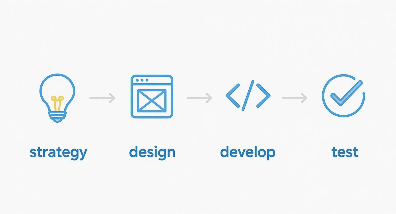
This workflow shows how a successful project is always built on a solid foundation of strategy and design, long before a single line of code is written. It’s all about making sure the final product solves real business problems.
Case Study: A B2B Service Transformation
Let’s look at another practical case: a B2B service company based in Adelaide. Their sales team used to spend hours back at the office creating complex quotes after meeting with clients. The whole process was slow, riddled with potential errors, and put a huge delay on closing deals.
Our answer was to deliver custom software development Adelaide in the form of a responsive web app their team could access on tablets. Now, their reps can configure and generate detailed, accurate quotes on the spot, right there with the client.
The change was dramatic:
- Shorter Sales Cycles: The time from that initial meeting to a signed contract was slashed by an average of 35%.
- Greater Accuracy: Automated calculations got rid of manual data entry mistakes, which meant quotes were far more precise.
- A More Professional Look: Presenting a polished, interactive quote on a tablet instantly projects a modern and efficient brand image.
This case is a perfect example of how responsive Web App development is more than just a customer-facing tool. It can be a powerful asset for sharpening up your internal operations and giving your team the tools they need to shine.
A great responsive web app should solve a specific problem for a specific user on a specific device. Whether it’s a shopper buying a dress on their phone or a technician accessing a manual on a tablet, the experience must be seamless and intuitive.
Case Study: An Integrated Operations Hub
For businesses juggling complex operations, responsiveness needs to go much deeper than the public-facing website. Many companies lean on Enterprise Resource Planning (ERP) systems to manage everything from inventory and finance to HR. A non-responsive ERP is a massive bottleneck for any modern, mobile workforce.
We recently completed an Odoo implementation Sydney businesses can use to run their entire operation. The big challenge was that managers and warehouse staff needed access to critical data while on the factory floor or out of the office. A desktop-only interface just wasn’t cutting it anymore.
Our team delivered a fully customised and responsive Odoo interface. This simple change allowed key people to:
- Check inventory levels from a tablet in the warehouse.
- Approve purchase orders from a smartphone on their commute.
- Access real-time sales dashboards from any device, anywhere.
This newfound accessibility led to faster decision-making and a massive boost in operational efficiency. This is the ultimate goal for any platform, whether it’s Odoo, WooCommerce, or a completely custom build: to make information accessible and actionable, no matter the screen. These real-world cases prove that investing in responsive design isn't just an expense—it's a direct path to greater efficiency, higher sales, and a healthier bottom line.
Ready to see how a responsive web app can deliver real results for your business?
Contact our team today for a consultation on expert software development in Sydney and Adelaide.
Ready to Build for Every Screen?
Let's wrap this up. If there’s one thing to take away, it’s this: thinking about responsive web app development as just another box to tick on a technical checklist is a massive mistake. It’s actually a core part of your growth strategy, especially here in Australia’s booming digital-first economy. Now’s the perfect time to take a hard look at your digital presence and ask a tough question: what opportunities are slipping through your fingers because of a clunky user experience?
Australia's tech scene, particularly in web application development, is growing at an incredible pace. But there's a catch. To keep this momentum going, we're facing a serious shortage of skilled IT talent—we'll need an extra 286,000 tech workers by the end of 2025. This creates a fascinating dynamic: the potential for growth is enormous, but finding the right people to help you seize that opportunity can be a real roadblock. You can dive deeper into Australia's tech job market on nucamp.co.
Let's Build Your Future, Together
Making your way through this landscape isn’t easy. It calls for a partner who not only has the runs on the board but also truly understands the local market. That's where we fit in. Think of us as your expert guide, here to walk with you from that first spark of an idea all the way to a successful launch, making sure every dollar you invest pulls its weight.
Don't let a frustrating user experience define your brand's future. A seamless, responsive web app is the single most powerful tool you have to win over customers, earn their loyalty, and make sure your business is ready for whatever comes next.
Whether you're looking for world-class software development in Sydney, a streamlined Odoo implementation in Adelaide, or to launch a powerful online store with Shopify or WooCommerce, our team has the expertise to make it happen. We don't just build apps; we build experiences that work beautifully on every single screen.
Ready to start the conversation? Reach out for a no-strings-attached chat, and let's begin building your responsive future today.
Frequently Asked Questions
When you're diving into responsive web app development, it's natural for questions to pop up. To give you some clarity, we've tackled a few of the most common queries we hear from business leaders, breaking them down into straightforward answers.
What Is the Difference Between a Responsive App and a Mobile App?
Think of a responsive web app as a chameleon. It's a single application that you access through a web browser (like Chrome or Safari), and it cleverly changes its shape to look perfect on any screen, whether it's a giant desktop monitor or a small smartphone.
A dedicated mobile app, on the other hand, is built specifically for one operating system, like iOS or Android. You have to download it from an app store. While these native apps can sometimes tap into a device's hardware more deeply, responsive web apps are often the smarter business choice. They’re more cost-effective, reach everyone instantly without a download, and are much easier to maintain because you’re only managing one codebase.
How Much Does Responsive Web App Development Cost in Australia?
Pinning down an exact cost for responsive web app development in Australia is a bit like asking "how long is a piece of string?"—it really depends on the complexity. For a fairly simple responsive app with core features, you might be looking at a starting point of around $25,000.
However, for a more sophisticated application loaded with custom features and third-party integrations, the investment can range from $60,000 to over $250,000. Think of a complex Shopify implementation or bespoke software development in Sydney. Enterprise-level systems, like a full Odoo implementation in Adelaide, are in a league of their own. Ultimately, the final price tag comes down to your vision, the technology stack, and the project's overall scope.
Can My Existing Website Be Made Responsive?
Most of the time, yes, an existing website can be retrofitted to become responsive. But the real question is: should it be? If your site is built on older, clunky code, slapping on a responsive layer is often just a band-aid solution. It can be far more practical and cost-effective in the long run to rebuild it properly with a modern, mobile-first mindset.
Starting fresh guarantees better performance, tighter security, and a seamless user experience that's much easier to manage down the track. We can take a look at your current site and give you an honest recommendation on the best path forward to hit your business goals.
Ready to build a web app that delivers a flawless experience on every single device? At Wistec, we create practical, solution-driven technology that gets results. Whether you need custom software development or a powerful WooCommerce store, we're here to help.
Contact Wistec today for a consultation and let’s start building your responsive future.